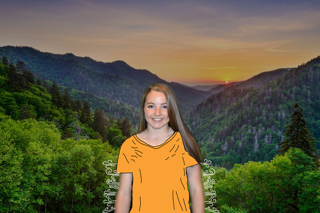
Photoshop
photo in your name
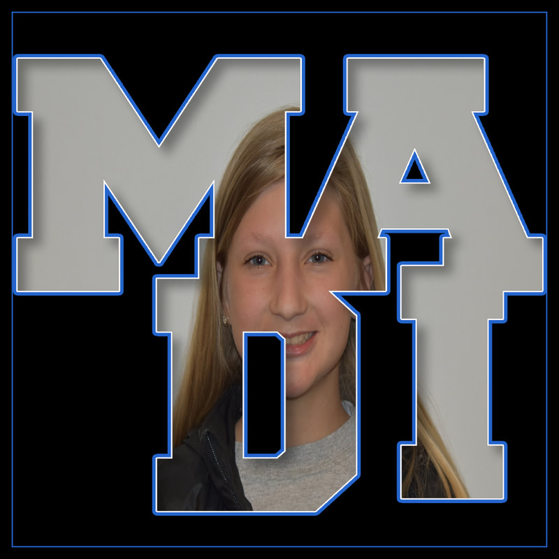
For this project we were asked to watch a tutorial and make whatever was shown. I learned how to make the inside of letters transparent to allow us to put a picture behind it.
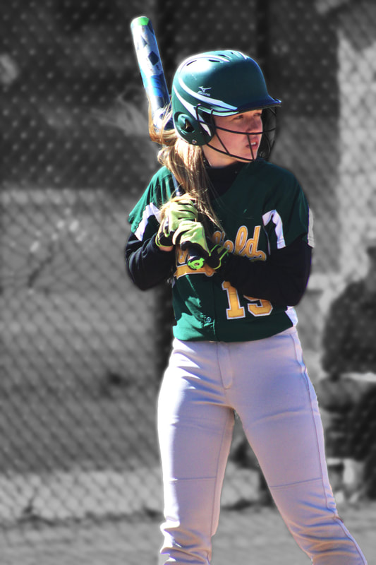
Pencil draw effect
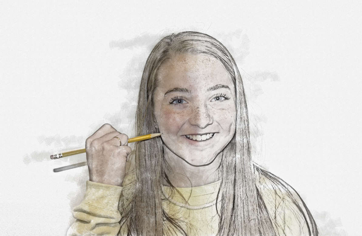
For this project we were asked to watch a tutorial and learn how to take a normal picture and make it look as if it were drawn. I caught on pretty quick and here was my final work.
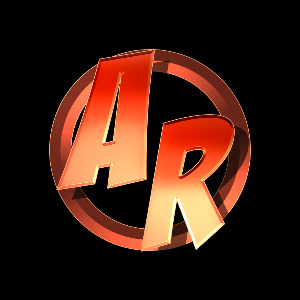
Logo designs
|
|
For these we were given a 2 week independent project. I decided to do a few photoshop pictures and some animations on illustrator. I got some ideas off of Pintrest, and others off of Youtube. Here are my logos I learned to make off of Youtube.
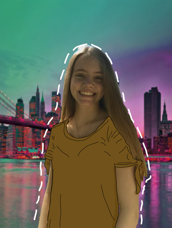
Photoshop play
|
|
For these we were given a 2 week independent project. I decided to do a few photoshop pictures and some animations on illustrator. I got some ideas off of Pintrest, and others off of Youtube. Here are my photoshop pictures that were inspired by some Pintrest post.
Movie pre/sequel
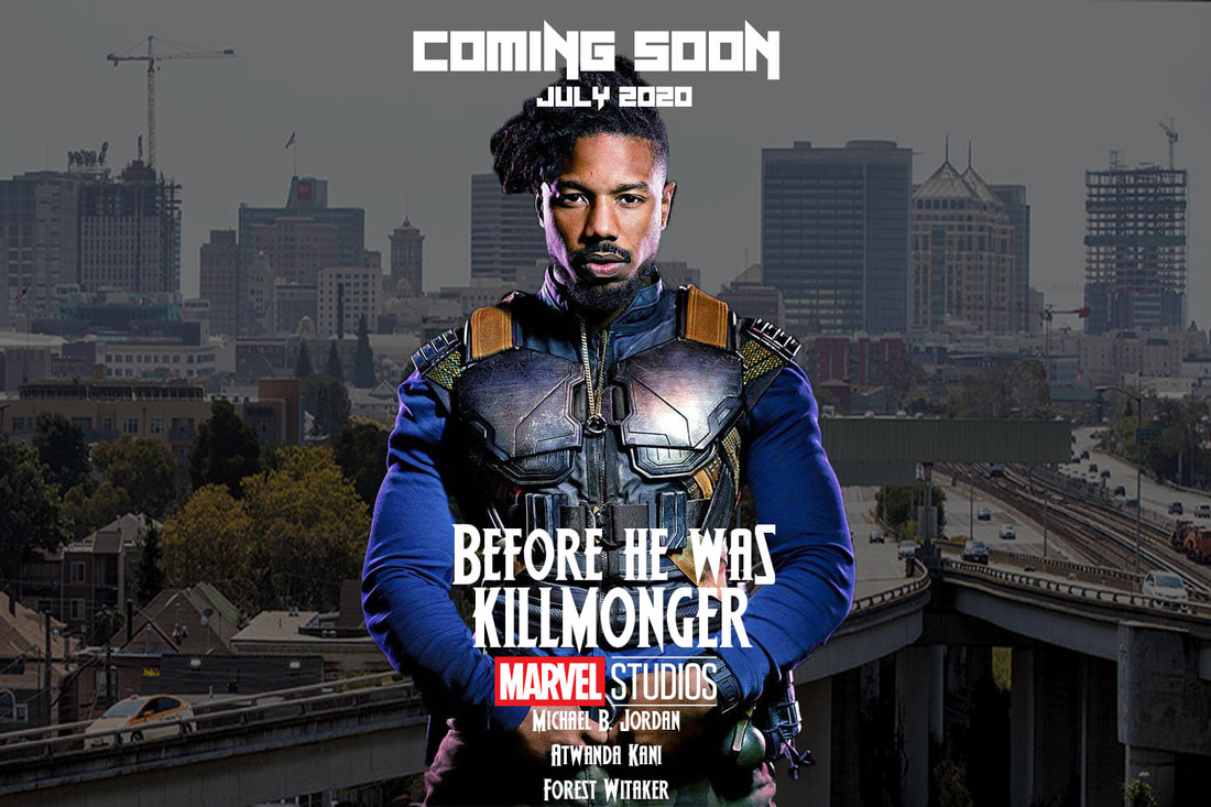
For this project the objective was to take a movie and make a prequel of sequel poster. I'm a big Marvel fan and one of my favorite movies is Black Panther. I decided to make one for Erik Killmonger, and here is my poster.
Photo collage
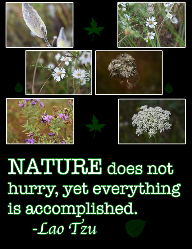
For this project we were asked to make a collage, using 6 pictures, text, and more elements of design. I took pictures of flowers, and other plants outside the high school. I applied my pictures, used brushes of leaves on the layers, and added a glow to my text and pictures.
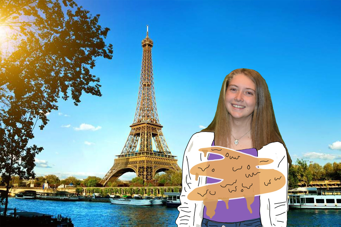
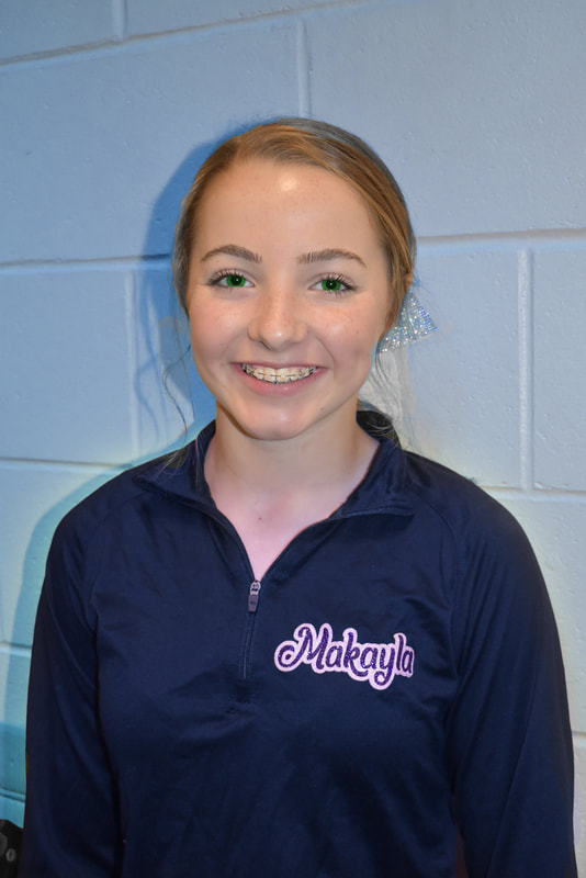
Camera raw pictures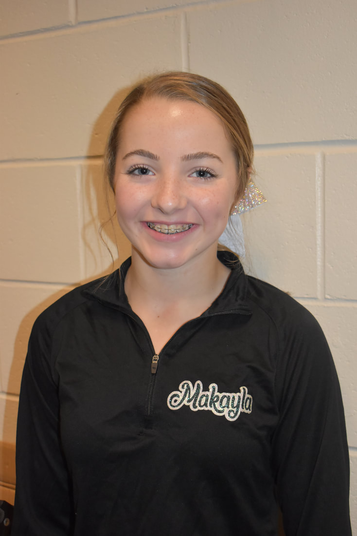
|
|
For this project we were asked to modify the original picture (to the left). I changed the color of her jacket, her name, the background and the color of her eyes.
Lake's cafe business ads |
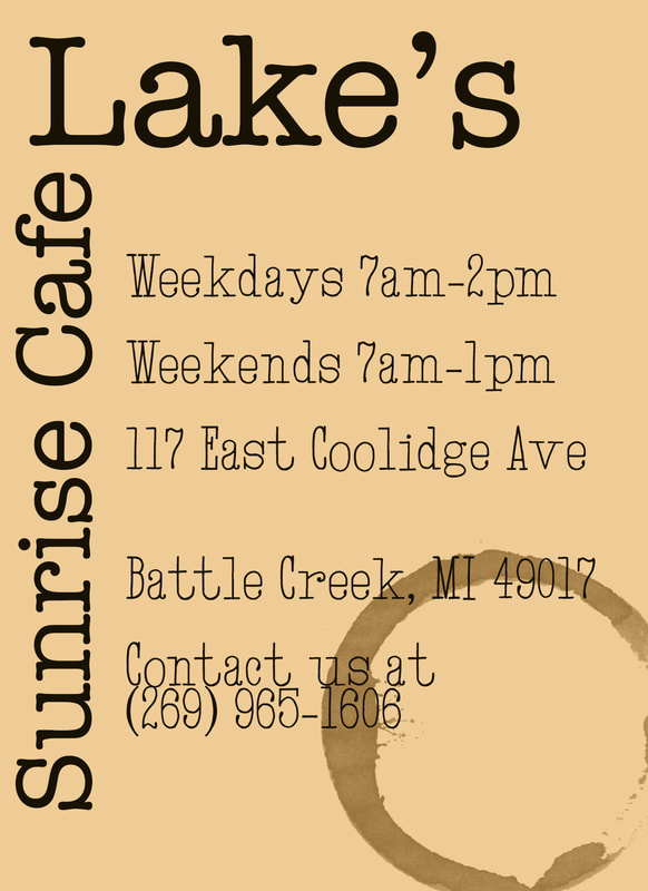
For this project, we were asked to make ads for Lake's Sunrise Cafe. The one(s) chosen will be put in this years yearbook. For this ad I put a cream background, I added a coffee cup stain on the bottom of the page, and I used a font that looked like it was from a type writer.
|
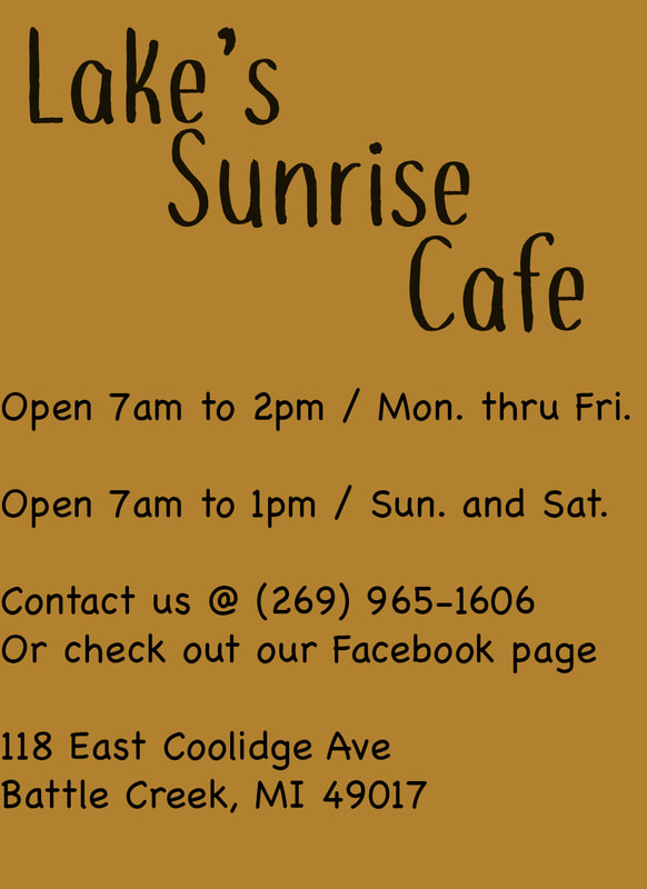
For this one I used a darker, brown background. I used some fonts that look like handwriting. This one is more simple.
|
Homecoming posters
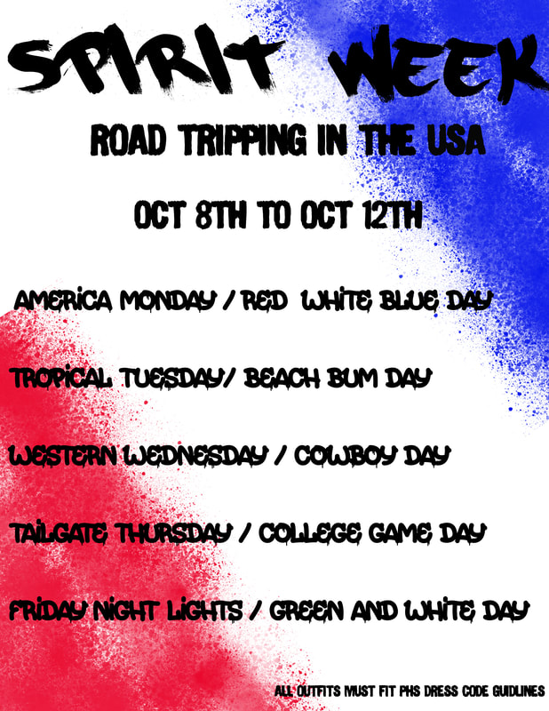
Poster 1: For this assignment, we were asked to design two homecoming posters, one for spirit week, and the other for the dance. This is the one I made for spirit week, I made spray paint on the sides, in red and blue with a blue background, to make the colors of the flag. I then made the font look like spray paint.
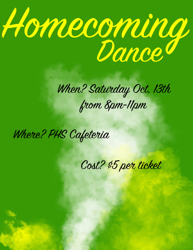
Poster 2: This is the poster I created for the dance. Every year everyone puts the same colors, same fonts, and same pictures. I didn't wanna do that, I made my font for this a cursive font, along with yellow and white smoke coming from the bottom of the green background. I did use the same colors, but that is why I tried to change up where and how they were.
